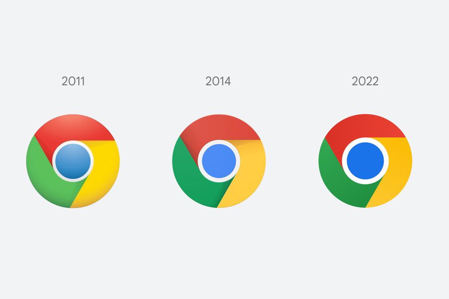
Chrome is changing its logo for the first time in eight years
Chrome is changing its logo for the first time since 2014, and if you squint really hard, you might actually be able to see what’s different. Elvin Hu, a designer for Google Chrome, offers a first look at the logo’s redesign in a thread on Twitter, as well as some of the thinking behind the ever-so-subtle changes.

Some of you might have noticed a new icon in Chrome’s Canary update today. Yes! we’re refreshing Chrome’s brand icons for the first time in 8 years. The new icons will start to appear across your devices soon.
— Elvin (@elvin_not_11) February 4, 2022
Instead of incorporating shadows on the borders between each color, essentially “raising” them off the screen, the red, yellow, and green are simply flat. And while not mentioned by Hu, the blue circle in the middle seems to be bigger and stares into your soul even more, but maybe that’s just my imagination.
The colors in the logo do look more vibrant (probably on account of the design team getting rid of the shadows), but there’s another change that I would’ve never noticed if I didn’t read Hu’s Twitter thread. Apparently, Google’s design team discovered “placing certain shades of green and red next to each other created an unpleasant color vibration.” To fix this and make the icon “more accessible,” they decided to use very subtle gradients — that I’m convinced the human eye can’t even see — to prevent any color vibration.
The main Chrome logo (the one you click on from your dock / taskbar to access the web) won’t look the same across all systems either. On ChromeOS, the logo will look more colorful to complement the other system icons, while on macOS, the logo will have a small shadow, making it appear as if it’s “popping out” of the dock. Meanwhile, the Windows 10 and 11 version has a more dramatic gradient so that it fits in with the style of other Windows icons. Hu says you’ll start seeing the new icon now if you use Chrome Canary (the developer version of Chrome), but it will start rolling out for everyone else over the next few months.
There are also some new icons for the beta and developer versions of the Chrome logo, with the most dramatic change being a blueprint-style icon for the beta app on iOS. Hu also notes that the design team experimented with a white line that serves as the border between each color, but found that this made the overall icon smaller, potentially making it harder to recognize among other Google apps.
From 2008 until now, the Chrome logo has been getting gradually simpler. What started out as a shiny, three-dimensional emblem has been squashed down into a 2D symbol of modernity. Maybe one day I’ll get my wish and see that almost tangible 2008 Chrome logo grace my desktop once again. But not today.
Related Questions
- 2024-04-25 Apple said to be working on custom AI server chip based on TSMC’s 3nm process
- 2024-04-25 Researchers use supercapacitor components to build new sodium-ion battery
- 2022-08-20 Google is seeking to improve search results by preventing unoriginal content
- 2022-08-16 Microsoft will turn off TLS 1.0 and 1.1 in Internet Explorer and EdgeHTML on September 13
- 2022-08-15 Google releases Read Along for the web: Teaching children how to read
Your opinion
- Hot Ranking
-
- How to upgrade from Windows 10 to Windows 11 for free
- How to avoid duplicate form page submissions
- Difference between line break markers and paragraph markers
- How to pass PHP variables to JavaScript in WordPress
- What is window.postMessage in HTML5?
- What is a weakly typed programming language
- How to implement browser forward and backward functions for web form buttons
- What is an XML document declaration?
- How To Determine Whether PHP Is Good for My Website or WordPress?
- What is a scripting language
- The table layout is suddenly very confusing
- The role of the unordered list ul tag
- What is the difference between fixed and absolute?
- What values can be used for the background-position property?
- The impact of automatic caching on dynamic pages
- Latest Answer
-
-

How to avoid duplicate form page submissions
binary options system strategy page Answer 2022-04-01 03:42:00
-

How To Determine Whether PHP Is Good for My Website or WordPress?
แอพเปลี่ยนรูปเป็นภาพวาด Answer 2022-03-27 18:27:12
-

The impact of automatic caching on dynamic pages
50 deposit binary options Answer 2022-03-24 05:31:20
-

How to avoid duplicate form page submissions
free binary options signals providers of goods Answer 2022-03-20 12:29:02
-

How to avoid duplicate form page submissions
binary options strategy 5 minutes 15 min no loss acord Answer 2022-03-20 09:44:29
-
